©2011 Google -
Code Home -
Site Terms of Service -
Privacy Policy -
Site Directory
Google Code offered in:
English -
Español -
日本語 -
한국어 -
Português -
Pусский -
中文(简体) -
中文(繁體)
Software
Documentation
Gadget Designer
The Google Desktop Gadget Designer is an integrated development environment (IDE) for desktop gadget design that lets you quickly prototype or modify your gadget's UI and test its performance. The Designer is part of the Google Desktop SDK. To get the latest version of the Designer, download the SDK.
This document assumes familiarity with the principles, objects, and interfaces described in the Creating a Gadget document. Here, we only explain how to use the Designer and do not go into any detail about object or property types, design guidelines, how desktop gadgets are packaged, how to write associated scripts, etc.
Note: This document covers Gadget Designer 1.0. The latest SDK contains Gadget Designer 1.1, which has new features that this document does not yet cover. To learn more about Gadget Designer 1.1, see the tutorial Using Gadget Designer.
Contents
- Overview of Designer's Gadget Creation Process
- Project Settings Dialog
- Project Explorer
- Tabs
- Display Pane
- Drag and Drop UI Objects
- Elements Pane
- Properties Pane
- Scripts Pane
- Menu Commands
Overview of Designer's Gadget Creation Process
The following summarizes the steps you take when creating a gadget using the Designer. Links go to the document section that describes the step in more detail.
- Launch Google Desktop Gadget Designer by double-clicking
the file
api/tools/designer*.exe, relative to the folder where you unzipped the Google Desktop SDK. In US English distributions, the name of the executable file isdesigner_en.exe. - Click
File > New Project.... Choose a location for your project's folder, enter a name for your project's folder, and clickSave. - In the Project Explorer,
open each language folder
(for example,
en) and double-clickstrings.xml. Update the text strings to name and describe your gadget. Add any other user-visible strings your gadget needs. - Click the
main.xmltab, and then drag and drop the UI elements that make up your gadget's UI into the Display Pane. - Add any necessary UI image files to the project. To do this, you need to use an external file browser, such as Windows Explorer. Add the appropriate files to the project folder, or write over existing files' content.
- Select each UI element in turn and set its property and event
values to ones appropriate for your gadget. Type
Ctrl+Sto save your work. - Optionally, click
Project > Add Options Viewto add an options view (to be defined inoptions.xml) to your gadget. Repeat steps 4-6, this time for the options view. - Open the
main.jsfile (or create and open a different script file if you prefer) and write the functions called by your UI element events. TypeCtrl+Sto save your work. - Test your gadget:
- Click the Preview top tab
(or choose
View > Preview Window) to display your fully functional gadget in the Display Pane. - Choose
View > Refreshto update the gadget. - Run a test on your gadget by trying to use it in some way.
- If an error occurs, try to fix it in the code or UI
(including properties). Save your fixes, then click
View > Refreshto reset the gadget to its initial state. Retry the test and repeat until it succeeds. - If no error occurred, choose
View > Refreshto reset the gadget to its initial state. Continue running tests until you're satisfied that your gadget works as you intended it to.
- Click the Preview top tab
(or choose
- Choose
Project > Build Package, which zips up all the files in your project and puts them in aProject_name.ggfile. - Distribute your gadget by submitting the
.ggfile at http://desktop.google.com/pluginsubmit
Remember to save your work by entering
Ctrl+S or choosing File > Save often, and particularly before starting
to test your gadget.
Note:
Gadget Designer does not have a way of adding files to a
project or its folder or subfolders. While File > New Project...
creates a number of files there as initially shown in the Project Explorer, you cannot add or delete files from
the gadget's folder from within Gadget Designer.
To add or delete files from the project folder,
use any external file browser tool, such as Windows Explorer. This
is also how you have to overwrite the content of any files created
by Gadget Designer, such as icon_large.gif.
Project Settings Dialog
|
To bring up the Project Settings dialog,
either double-click |
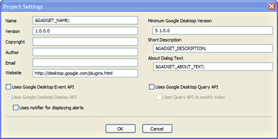 |
Project Explorer
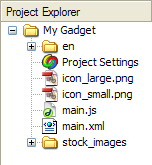
The Project Explorer shows the directories and files
that will be zipped up to create the
gadget_name.gg file used to distribute your gadget.
The top-level folder has the name you gave
the gadget in the Project Settings
dialog. It initially contains the following directories and files.
enfolder: This folder contains thestrings.xmlfile where you and the Designer store the US English version of any strings used in your gadget's UI. See Internationalization for details.Project Settings: Double-click this to bring up theProject Settingsdialog.icon_large.gif: File containing the large icon image associated with your gadget. You should replace this file with one containing an appropriate large icon for your project.icon_small.gif: File containing the small icon image associated with your gadget. You should replace this file with one containing an appropriate small icon for your project.main.js: A default JavaScript file into which you can write functions that implement your gadget's behavior and event handling. Double-clicking this opens the file in the Display Pane for editing, and adds a tab for that display to the top of the Display Pane area. After editing the file, use eitherFile > SaveorCtrl+Sto save your edits.main.xml: The XML file that defines your gadget's UI layout/view. Double-clicking this entry effectively presses themain.xmltab on top of the Display Pane, and showsmain.xml's contents in the Display Pane. You cannot edit the source code for this file in the Display Pane.stock_imagesfolder: Contains pre-loaded UI component image files, such as buttons and checkboxes.
Remember that to add, delete, or copy over content in files shown in the Project Explorer, you have to use an external file browser, such as Windows Explorer. The Project Explorer should be thought of as a visual display of the contents of your gadget's folder, not a way of manipulating those contents.
Tabs
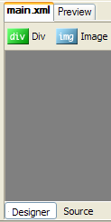
Initially, there are four tabs around the
window's central Display Pane area, two at the top and two at the
bottom. We've already seen how a
main.js tab can be added to the top by opening the
file from the Project Explorer. Later on, we'll see
other ways how tabs may be added to or removed from the top.
- Top tabs:
main.xml: When selected, Designer shows the contents of your gadget'smain.xmlfile in the Display Pane area. Depending on which bottom tab is selected, it shows either the gadget's UI as defined by the XML contents or the actual (though non-editable) XML code.Preview: Displays your gadget's UI and executes any scripts or functions associated with UI elements. Essentially, this lets you run and test your gadget outside of the Sidebar and Google Desktop. For example, if your gadget's script responds toview.onopenevents by changing the gadget's background color, you can see that color when inPreviewmode.
- Bottom tabs (visible only when an XML tab is selected):
Designer: Show the actual gadget UI.Source: Show the XML code that defines the gadget's UI; you can't edit the XML code in this view.
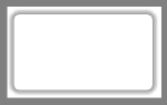
Display Pane
|
The central display area initially consists of
a white rectangle containing a default background image,
surrounded by a larger gray rectangle. The white
rectangle shows the current appearance of your gadget and represents the
overall |
 |
Drag and Drop UI Objects
 |
This is how you initially define your gadget's UI. Just click your mouse over any one of these UI elements and drag it down to the position in the white display area where you want it to appear in your gadget. Release the mouse button, and that UI element is now both in the gadget and selected. The selected UI element's properties appear in the Properties Pane to the right. Just click a UI object in the display area to make it the currently selected UI object. The UI objects have all the properties,
methods, and events described in the Gadget API Reference. Remember that the
objects shown here all inherit from the
|
Elements Pane
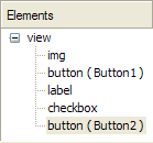
Once you have one or more UI elements in the Display Pane, you can select an element either by:
- Single-clicking it in the Display Pane.
- Clicking its name in the Elements Pane.
When an object is first put in the Display
Pane, it appears as a child of the view element
in the Elements Pane with only its type as an identifier. For
example, if you drag the Button element into the
Display Pane twice, the Elements Pane shows two items, both
designated by button. If you give an element a name,
for example Button1, it appears in the Elements
Pane in the form button
(Button1).
Note that the only way to get access to the
view object's properties and events is to click the
view entry in the Elements Pane.
Properties Pane
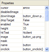
The Properties Pane shows the property names and values for the currently selected UI object. This is also where you can edit an object's property values and what functions are associated with its events.
To edit a property value, just click its name or value. Your input options depend on the property type.
- If it's a boolean property, the value changes to have a small
pulldown menu with
trueandfalsevalues. Click the value you want for the property. - If it's a numeric or text valued property, just type the new value
in the value field and press
Enter. - Some property values, such as
maskor adiv'sbackground, can be either a string or a file. For this property type, a small box with 3 dots appears. If you click the box, anOpen Filebrowser window appears so you can choose a file to be the property's value. If you want a string value instead, just type it into the value field and pressEnter.
The display changes, if needed, to reflect the UI object's new property value.
Note that some properties, such as
cursor, have a defined and limited
set of allowed values. The Designer does not check for whether
your entered value is part of the property's allowed value set.
However, when you try to display your view, this will cause an error.
Also, note that the overall
view object, accessible by selecting it in
the Elements Pane, has its own set of properties and events. If,
for example, you want to change the size of the view itself,
click view in the Elements Pane
and then change the height
and width values in the Properties
Pane.
For events, just enter the
name of a function that's defined in a script file
included in the gadget.
For example,
assume you define a function in
main.js
to handle clicks on a button.
To associate the function with the event,
set the button's onclick property
to the function's name —
for example,
button_onclick().
Scripts Pane
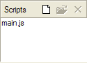
This pane shows any script files used by the gadget
in its currently displayed XML file. These will be zipped up with
the UI XML and image files when you finish designing your gadget.
By default, it first contains only an
main.js file, but you can add
other script files and/or remove
main.js
To add a script file to the Scripts Pane, click
the sheet of paper icon at the left of the three icons. It
opens a file browser set to show only script files, starting from
your gadget's folder. Find the script file you want to add and click
Open. Note that the script file
must already exist before you can add it here. Unlike
File commands, this copies the
script file into the project folder and causes Designer to show it
in the Project Explorer. It also adds a line
<script src="filename"
    />
to whatever XML file is currently active in
the Display Pane. For example, if
main.xml is active, the
<script src="filename"/>
line is added only to
main.xml and not to
options.xml.
In the Scripts Pane, once you have selected one of its script files by clicking it, you can:
- Open the file for editing by clicking the middle open file icon. This adds a new top tab labeled with the filename. It also picks that new tab, changing the Display Pane to an edit pane for the file's contents.
- Remove the file from the Scripts Pane by clicking the right X icon. Note both that the script is removed immediately without a confirmation dialog and that the script's file is still present in the Project Explorer and will be zipped up as part of the gadget unless you delete it from the gadget's folder as well, via an external file browser tool.
An important point is that the Scripts Pane is not showing what script files are stored in the project folder, but rather what scripts are used in the view-defining XML file currently on display.
If you look at
main.xml right after its creation via
File > New Project..., it has a line
<script src="main.js" /> in its
<view> element.
main.js
is also listed in the Scripts Pane, as well as
the Project Explorer.
If you remove
main.js from the Scripts Pane, what happens is that
the <script src="main.js" /> disappears from the
<view> element, meaning your gadget's view no
longer knows about any functions defined in the file. The file
itself is still present in the project's folder, and must be
removed from it via an external file browser program (if you want
the file removed); otherwise it will be zipped up into the
.gg file with the other project
files.
Note that the order of script files is important.
If code in a script file A.js
refers to code in a script file B.js,
then B.js must be before A.js
in the list of script files.
To change the order of script files,
edit the appropriate .xml file
using an external editor.
Finally, note that by default when creating a
new project, main.xml
automatically contains the
<script src="main.js" />
line and main.js
contains a definition for the
view_onOpen() function that
main.xml uses. If you delete
main.js from the Scripts Pane without providing a
substitute function definition or rewriting
main.xml so that it no longer uses
view_onOpen(), you get an error.
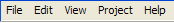
Menu Commands
|
The following menus are at the top of the
Designer window: |
 |
File Menu Commands
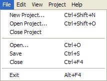
File has the following menu commands:
New Project...: Opens a dialog for you to specify the new project's location and name. When you clickSave, the new project appears in the Designer window.Ctrl+Shift+Nis the keyboard equivalent.Open Project...: Closes the current project (offering you a chance to save it, if necessary) and opens a file browser set to show.ggand.gmanifestfiles.Usually, you select the
.gmanifestfile of the gadget you wish to modify. If you instead select a.ggfile, you'll be prompted about whether to extract the gadget to a folder so it can be opened. ClickYesto bring up a dialog that lets you choose the folder that will contain the project folder. Then clickOKto extract the gadget.The gadget you select becomes the current project and appears in the Designer window.
Ctrl+Shift+Ois the keyboard equivalent forOpen Project....Close Project: Closes the current project, leaving the Designer window blank except for the top Menu Commands. You will be prompted to save any modified files.Open...: Opens a file browser set to show text files, including XML and script files. Selecting and opening a file creates a new top tab labeled with the filename, as well as selecting the new tab and showing the file's contents in the Display Pane area. Note that the new file is not added to your gadget's folder as shown in the Project Explorer, as the file is not in the project folder. To add a file to the project folder, use an external file browser, such as Windows Explorer.Ctrl+Ois the keyboard equivalent.Save: Saves any open gadget files. This needs to be done whenever you edit a file or change a UI object's properties.Ctrl+Sis the keyboard equivalent.Close: Immediately closes whatever file is currently visible in the Display Pane and removes the file's top tab. The file itself is still present in the Project Explorer.Ctrl+F4is the keyboard equivalent.Exit: Puts up a popup asking if you want to save changes to yourmain.xmlfile. After you clickYesorNo, it shuts down Gadget Designer.Alt+F4is the keyboard equivalent.
In addition, any recent projects appear in a
menu section just above the Exit
command. Clicking a recent project opens it in the
Designer.
Edit Menu Commands
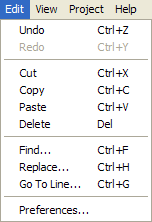
Edit has the following menu commands:
Undo: Reverts the action you took in the Designer, such as changing a property value, moving a UI object, creating a new object, etc.. You may do multiple consecutive undoes to backtrack over a series of operations.Ctrl+Zis the keyboard equivalent.Redo: Grayed out unless you've just done an undo operation, this redoes the last undone operation. If you've done multiple consecutive undoes, you can do multiple consecutive redoes to restore the Designer state.Ctrl+Yis the keyboard equivalent.Cut: Standard cut operation, which works on selected UI elements in the Display Pane.Ctrl+Xis the keyboard equivalent.Copy: Standard copy operation, which works on selected UI elements in the Display Pane. Note that when you copy a UI object, it makes an exact copy including all property values. For example, if you copy a button namedButton2, the copy will also have the valueButton2for its name property. The two buttons will appear identical in the Elements Pane.Ctrl+Cis the keyboard equivalent.Paste: Standard paste operation, which works on selected UI elements in the Display Pane.Ctrl+Vis the keyboard equivalent.Delete: Standard delete operation, which works on selected UI elements in the Display Pane.DELis the keyboard equivalent.Find...: Searches for the specified string in the source file you're currently viewing.Ctrl+Fis the keyboard equivalent.Replace...: Searches for a string and replaces it with another string.Ctrl+His the keyboard equivalent.Go To Line...: Moves the cursor to the specified line in the source file you're currently viewing.Ctrl+Gis the keyboard equivalent.Preferences...: Lets you specify startup preferences.
View Menu Commands
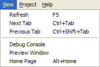
View has the following
menu commands:
Refresh: Refreshes the various objects and panes in the Designer window. Most importantly, it re-initializes all the gadget's global variables and property values and any global scope code is now executed from the beginning. Essentially, it resets the gadget to its original state, which is very useful when testing your gadget.F5is the keyboard equivalent.Next Tab: Effectively clicks the top tab to the right of the currently selected tab. If the last tab is currently selected, it cycles back to clicking the first tab.Ctrl+Tabis the keyboard alternative.Previous Tab: Effectively clicks the top tab to the left of the currently selected tab. If the first tab is currently selected, it cycles back to clicking the last tab.Ctrl+Shift+Tabis the keyboard alternative.Debug Console: Opens a debug console at the bottom of the Designer window (taking up space previously used by the usual window contents; you may want to resize the window to restore the other contents to their previous size). Depending on which checkboxes are selected, debug, info, warning, and/or error messages from previewing/running your gadget apppear here. You can also choose whether or not the messages should include when they happened. To make the Debug Console invisible, click theDebug Consolemenu item again.Preview Window: Changes the Display Pane so that it displays your gadget in a running mode, allowing you to test the UI and see it work. Equivalent to clicking thePreviewtop tab.Home Page: Shows the Gadget Designer home page in the Display Pane.Alt+Homeis the keyboard equivalent.
Project Menu Commands
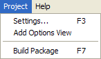
Project has the following menu commands:
Settings...: Brings up theProject Settingsdialog.F3is the keyboard equivalent.Add Options Viewadds anoptions.xmlfile to the project, anoptions.xmltab at the top, and grays outAdd Options Viewsince you can define only oneoptions.xmlfile per project. After clicking this, you'll need to create and test the options view and its UI by the same means you used for the main view.Build Package: Zips up the files for your gadget and puts them in aProject_Name.ggfile for distribution.F7is the keyboard equivalent.
Help Menu Commands
|
|
 |